Printing Arabic Text: Stroke, Dots and Minimum Sizes
How small Arabic lettering can be 3D printed: stroke widths, dots, harakat, raised vs engraved text, which script styles survive, and how to export it right.
The short answer
For raised Arabic text printed facing up, keep the thinnest stroke at least 1 mm wide, the alif at least 8 mm tall and each dot at least 1 mm across with a clear gap from its letter. Engraved text needs strokes about 1 mm wide and at least 0.6 mm deep. Below these sizes dots merge or vanish and harakat disappear, so simple Kufi or Naskh styles print far better than Thuluth or Diwani.
Arabic is harder to print small than Latin text, for reasons that come straight from the script: the dots, the thin connecting strokes, the harakat floating above and below, and the calligraphic styles whose beauty is in a hairline taper. None of that stops it printing well. It just changes the minimum sizes.
Why Arabic needs more room
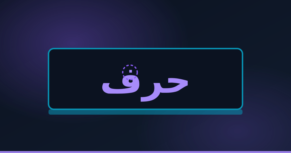
- Dots are separate, tiny islands. A printer has to start and stop for each one, and below a certain size it cannot draw a clean dot at all. Lose a dot and ب becomes ت, or a name changes.
- Joins can be thin. In many fonts the stroke that connects two letters is the thinnest part of the word, and it is the first to break or vanish.
- Harakat sit far from their letters and are smaller still: fatha, kasra and shadda are often the first things to go.
- Calligraphic styles taper. Thuluth, Diwani and many decorative fonts end strokes in a fine point that a printed line simply cannot reproduce.
Minimum sizes, as practical guidance
These are working figures for FDM printing, the process we use. They assume the text sits on a flat face that prints facing up, which gives the cleanest result. They are not guarantees; a bold, open font can go a little smaller and a delicate one needs more.
| Feature | Raised (embossed) | Engraved (debossed) |
|---|---|---|
| Thinnest stroke | 1 mm (0.8 mm at a push) | 1 mm |
| Height of alif | 8 mm | 10 mm |
| Dot size | 1 mm across | 1.2 mm across |
| Gap between dot and letter | 0.8 mm | 0.8 mm |
| Raised height or depth | 0.6 to 1 mm | At least 0.6 mm deep |
| Harakat | Only with an alif of 15 mm or more | Only with an alif of 15 mm or more |
Raised or engraved?
Raised text is easier to read at small sizes and takes a second colour well, for example white letters on a black plate. Multi-colour printing explains what that adds to the price. Engraved text is tougher, because nothing sticks out to snap off, which suits a keyring or anything handled every day. Its weakness is that tiny counters, the enclosed holes in letters like و and ص, can fill in, so engraved text wants a slightly larger size.
Cut-out letters for signs
Free-standing letters, the kind mounted one by one on a wall, need much thicker strokes: keep them above 4 mm, as in our guide to printed signs and lettering. The connected script helps here, because a connected word prints as one piece. It also creates a problem: letters that do not join forward (ا د ذ ر ز و) split a word into separate pieces, and every dot is its own loose part. Either join them with a thin backing bar, extend a connecting stroke with a kashida, or mount the letters on a plate.
Choosing a style
- Kufi and geometric styles: the safest. Even stroke widths, square dots, and they stay readable small.
- Simple Naskh: good from medium sizes, as long as the font is not one with very fine joins.
- Ruq'ah: fine for short words and names at a reasonable size.
- Thuluth, Diwani and decorative calligraphy: keep them large. On a wall piece they look wonderful; on a keyring they turn to a blur.
Getting the text into a 3D file correctly
This catches more Arabic designs than any printing limit. Many 3D modelling programs do not shape Arabic: they show letters in their isolated forms, unjoined, and sometimes left to right. Always check the result letter by letter before exporting. A reliable route is to set the text in a program that handles Arabic properly, convert it to outlines, export it as a vector file, and then raise or cut it in the 3D program.
- Type the text and choose the font in software that joins Arabic correctly.
- Convert the text to outlines or curves.
- Count the dots and harakat after converting. Small separate shapes are the ones that get lost.
- Import into your 3D program and raise or cut the outlines.
- For a stamp, mirror the text, so it reads correctly when pressed.
If that is more than you want to do, send the text exactly as typed, the font or style you like, and the size through custom projects. It is set and checked for you, and you approve a preview before printing. Names on keyrings, plaques and cake toppers are a natural fit for this; personalised gifts covers prices and timing.
Already have a file? Upload it on the home page for an instant price, and mention the smallest text size in your message if you want it checked before printing.
Frequently asked questions
How small can Arabic text be 3D printed?
As practical guidance for FDM printing, raised Arabic text needs strokes at least 1 mm wide and an alif at least 8 mm tall, with dots at least 1 mm across. Smaller than that, dots and thin joins start to merge or disappear.
Which Arabic font is best for 3D printing?
Kufi and other geometric styles with even stroke widths print best at small sizes. Simple Naskh works from medium sizes. Thuluth, Diwani and decorative calligraphy have hairline tapers and should only be printed large.
Can harakat be 3D printed?
Yes, but only when the text is fairly large, roughly with an alif of 15 mm or more. On smaller text, fatha, kasra and shadda are too small to print cleanly and are usually left out or enlarged.
Is raised or engraved text better for a 3D printed name?
Raised text reads better at small sizes and can be a second colour. Engraved text is tougher because nothing sticks out to break, which suits keyrings, but it needs a slightly larger size so small holes in letters do not fill in.
Why do my Arabic letters appear disconnected in my 3D software?
Many 3D programs do not shape Arabic, so letters show in isolated forms or in the wrong direction. Set the text in software that joins Arabic correctly, convert it to outlines, and import those into the 3D program.
Got a file to print?
Instant price, delivered anywhere in Lebanon for a flat $5.